# Theme Settings
Before you customize your theme, it’s best practice to duplicate your theme to create a backup copy. This makes it easy to discard your changes and start again if you need to.
1. From Shopify admin, go to ***Online Store > Themes.***
2. Click `Actions` then `Duplicate`
The theme editor includes a theme preview and a toolbar that you can use to add and remove content, and to make changes to your settings.
### Theme Editor
The theme editor toolbar (on the left) is divided into `Sections` and `Theme settings`.
* You can use [Theme sections](https://joomlart.gitbook.io/peaks-documentation/theme-sections#edit-sections) to enhance and re-arrange the content and layout of the different pages on your store.
* You can use [Theme settings](#theme-settings) to customize your store’s appearance and make changes to your social media links and checkout settings.
#### Open editor
1. From Shopify admin, go to **Online Store > Themes.**
2. Click `Customize`
### Theme Settings
You can edit your theme settings to customize your online store’s content, layout, typography, and colors. Each theme provides settings that allow you to change the look and feel of your store without editing any code.
#### 1. Multiple Layouts
Under your **Multiple Layouts** settings, you have the option to select each layout for the different Header, footer, and Blog page
#### 2. Color
Under your **Colors** settings, you have the option to select each color for the different elements of your storefront, including the text and content of the headers, borders, badges, background, and accents.
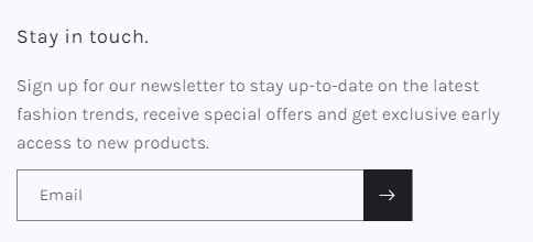
#### 3. Newsletter Popup
\#Start Growing your email list NOW! Planning to launch a new campaign? Introducing a new product? Let's send an email to your potential customer and all these starts with an email list. Poppy Email Popup allows you to build Email Collecting Pop-up on your Shopify Store in 3 mins without touching any codes. Our Email Collecting Pop-up helps you to collect emails from existing customers as well as potential customers who drop by your store. The enriched email listing provides your a...
#### 4. Typography
In your **Typography** settings, you can change the font, size, capitalization, and format of your storefront's text.
If the fonts that you wish to use are not available in the drop-down menu, you can follow our how-to guide on [uploading your own custom fonts.](https://joomlart.gitbook.io/peaks-documentation/extras/upload-custom-fonts)
* **Heading**: You can change Font-size and font family for all the H1 -> H6, Product Title, and Blog Title.
* **Body**: You can change Font-size and font family for all paragraphs.
#### 5. Layout
Layout Setting
Use range slider to choose between a page width of 1000px or 1600px. The default setting is 1600px.
\[Optional] Add **vertical space between sections** with the range slider. You can add a maximum of 100px between sections.
\[Optional] If you have a **Grid** layout, use the **Horizontal space** and **Vertical space** range slider to add space between grid content. Adding horizontal space will add a maximum of 40px of space to your rows, whereas adding vertical space will add a maximum of 40px of space to your columns.
#### 6. Buttons
You can customize the settings for call-to-action buttons on your online store by adding shadows, changing the spacing or opacity, and adjusting the shape of your buttons.
Use the sliding scales to change the appearance of your button **Border**.
Use the sliding scales to change the button **Shadow**. Setting the shadow opacity to 0% removes the Shadow
Buttons Setting
Buttons Section
#### 6.1. Borders and shadows
You can adjust the borders and shadows of some interactive content types, such as drawers, buttons, variants, or quantity inputs.
Customizable options for **borders** are:
* **Thickness**, which changes the outline of the item.
* **Opacity**, which sets the visibility of the item outline.
* **Corner radius**, which rounds the corners of your items.
Options for **shadows** are:
* **Opacity** changes the visibility of the item's shadow. A shadow opacity of 0% removes the item shadow entirely.
* The **Horizontal** or **Vertical** offset range sliders move the location of the shadow around the item.
* Use the **Blur** range slider to change the opacity of the item's shadow.
#### 7. Variant pills
Variant Pills Setting
Variant Section
Variant pills allow you to display the variants of a product on a product page or a featured product section. Customers can select the desired variant to add the product to their cart without needing to change product pages.
Use the sliding scales to change the appearance of your variant pill **Border**.\
Use the sliding scales to change the variant pill **Shadow**. Setting the shadow opacity to 0% removes the shadow.
#### 8. Inputs
Input setting
Input type
Inputs are interactive areas that require customer input, for example, a quantity selector, an email signup form, or cart notes. You can adjust the appearance of your online store inputs in theme settings.
#### 9. Card
Cards are compartmentalized areas in sections that allow you to display multiple items, for example, product cards, blog cards, collection cards, or collage cards. You can customize the shape, style, color, alignment, and image padding of your section cards.
1. Use the dropdown menu to choose a card **Style**.
2. Add **Image padding** with the sliding scale. This adds space around your card images.
3. Use the dropdown menu to set the **Text alignment** for your cards. Choose between left, center (default), or right.
4. Use the dropdown menu to select a **Color scheme** for your cards.
5. Use the sliding scales to change the appearance of your card **Border**.
6. Use the sliding scales to change the card **Shadow**. Setting the shadow opacity to 0% removes the shadow.
#### 10. Content containers
Content containers Setting
Containers are the text portion of content sections, for example, the text box on a slideshow, an image banner, or the columns in multicolumn sections. You can customize the appearance of content containers for your online store.
#### 11. Media
Media is the visual component of sections, for example, product media or the image in Image with Text sections. You can add borders and shadows to your media.
#### 12. Dropdowns and pop-ups
Adjust the appearance of navigation dropdowns, pop-up modals, and cart pop-ups.
1. Use the sliding scales to change the appearance of your **Border**.
2. Use the sliding scales to change the **Shadow**. Setting the shadow opacity to 0% removes the shadow.
#### 13. Drawers
Drawers are hidden, interactive containers that appear and disappear when tapped or clicked, for example, a collapsible navigation menu or filter options.
#### 14. Badges
Sale and Sold out badges are automatically added to your product images when the price drops, or when the inventory count reaches 0. You can adjust the position, shape, and color of your badges.
Page and Blog badges appear on relevant search results. You can customize the position and shape of these badges, but not the color.
1. Use the dropdown menu to select the badge position within product cards. Choose between the top left, top right, bottom left (default), or bottom right.
2. Add rounded corners with the **Corner radius** sliding scale. Setting the corner radius to 0px produces square badge edges, and increasing the radius rounds the edges of the badges.
3. Choose a **Color scheme** for your badges. You can set an alternate color scheme for sold-out items.
#### 15. Icons
Icons are small images that can be added to certain sections or blocks. Set the color scheme for your icons in Theme settings.
Use the dropdown menu to select the default color for your icons. Choose between Accent 1, Accent 2, Outline button, or text color for your store icons.
#### 16. Social Media
You can add social sharing buttons for your products and blog posts, and links to your social media accounts. Links to your social media accounts show in the footer of your online store.
To add links to your social media accounts, enter the links to your accounts in the fields provided under Accounts. Enter full links, such as , or .
#### 17. Search behavior
Online Store includes predictive search, which shows product suggestions when customers start typing into the search field. Product suggestions can help customers articulate and refine their search queries, and provide new ways for them to explore an online store. They can also let customers quickly browse matches without having to leave their current page to see a separate list of search results.
You can customize the following settings for search:
* **Enable product suggestions** - Enable or disable product suggestions.
* **Show vendor** - Show or hide vendors in product suggestions.
* **Show price** - Show or hide prices in product suggestions.
#### 18. General
You can add a favorites icon, or a favicon, which can help to brand your online store. A favicon shows in the following places:
* your web browser tab
* your web browser's history
* icons on your desktop
* besides your online store name when it is bookmarked
1. In the **Favicon image** area, click **Select image**, and then do one of the following:
* To use an image that you have already uploaded to your Shopify admin, click on an image to select it and click **Select**.
* To use an image from your local computer, click **Upload**. Choose an image from your computer and click **Open** to start the upload. It will be automatically selected when the upload is finished. Click **Select**.
* To select a free image, click **Free images** and search for or click an image to select it.
2. Enable the Back to top button.
#### 19. Currency format
You can choose to have product, cart, and check-out prices always show currency codes.
#### 20. Cart
You can change the style of the cart on your online store. When a customer adds a product from your store to their cart, the cart can appear as a drawer, a page, or a pop-up notification. When the customer's cart is empty, you can display a featured collection in the cart drawer.
1. Use the drop-down menu to select a cart style: drawer, page, or pop-up notification.
2. Optional: To show the vendor the items in a customer's cart, click **Show vendor**.
3. Optional: To provide customers with an area to make special requests or add extra order information, select the **Enable cart note** option.
If you have the cart type set to *Drawer*, then you can display a collection in the cart drawer. The selected collection only appears when the cart is empty.
To add a collection to the empty cart drawer, click **Select collection**. Once a collection has been selected, click on **Change** to select a different collection or remove the collection from the cart drawer. You can also click on **Create collection** to create a new collection. This button takes you out of Theme settings and to the [Collections](https://shopify.com/admin/collections/new) area of your Shopify admin.
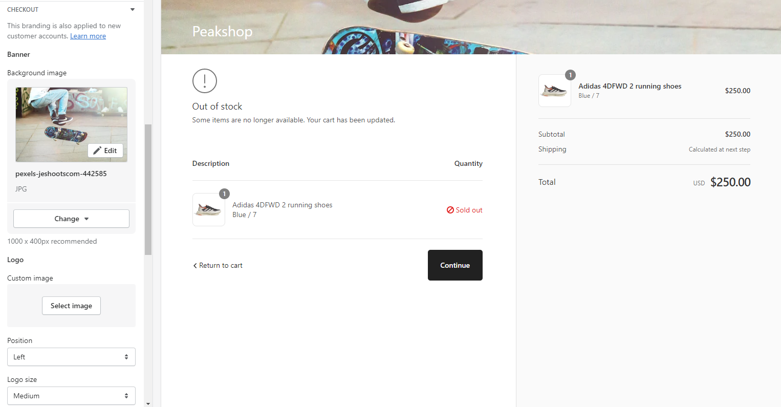
#### 21. Checkout
This section lets you customize your store's checkout. Refer to [*Shopify checkout*](https://help.shopify.com/en/manual/checkout-settings) for more information about your store's checkout page.
#### Password Page
You can edit the content that shows on your password page, such as the background


.png?alt=media&token=844e640f-bf31-4ba4-be43-1f26ce77bbaf)
.png?alt=media&token=fb57a18c-31db-4ee6-8c8c-7a89b55106cb)